"Let Them Eat Cake!"
It was about a month ago we were given the task to design a space for holding a dinner that would contribute to the suppression of world hunger; taking place in the year 2015, there have been two days established as days of dining to do just this. My design ended with some of the initial plans I created, and over time I began to appreciate the complex process of designing a space; the small details count.
The Drawings
I chose to develop the drawing first because I believe it helps me better understand a space that had not yet been built. The drawings served as instructions to build the scale model. After building the sketch model I went back to the drawings and made some adjustment; I did this a few times to reach my end product. While the drawing helped me create the space, the sketch model really put it in perspective.
 |
| Plan View |
The plan drawing ended up being my most useful one; I referred back to this drawing for all my other drawings and the model as well.
 |
| Axonometric View |
I really enjoyed drawing the axonometric view; it is almost like putting a puzzle together and figuring out what direction and angles each line went.
 |
| East Wall Elevation |
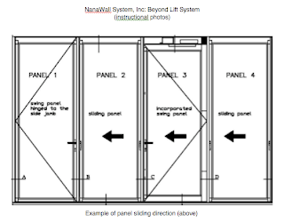
For my elevation drawing, I chose to draw the east wall, which is the Nanowall System. It is not the main focal point of the room however, it gives the room and dining experience the ‘open area’ appeal that I wanted from the very beginning. The individual glass panels are on a track system that enables them to side apart from each other and stored into a wall cubby to conceal them.
 |
| Dining Table Orthographic |
The table I designed for the dining space is a large rectangular table made out of a natural wood. I plan for the room to have neutral, light colors; the table would stand out compared to its surroundings. I intended for it to be a focal point being that the event is a dinner.
 |
| Side Table Orthographic |
The side table has the same wood material for the base, as the table. However, the surface material would be a dark marble; letting the side table to stand out, but not steal the attention from the table.
 |
| Perspective |
I was very selective on what I wanted colored on my perspective drawing. I wanted to emphasis certain details of the space as well as allude to the movement of the room. When looking at the floor it seems to show the flow of traffic or an idea of it, this is what I was aiming for because the stairs lead down into a living room space where the guests could relax and chat before and/or after the meal.
sources:


